


DROP
Pearlfisher "Fresh Pearls" Brief

2
I wanted to really focus on the true adversities this target audience were facing, and how they aspire to be living. Through extensive research and persona analysis, I was able to reach my insight and see the solution:

1
Brief
The


3
Through the audience preferences identified in my research, I knew I wanted the brand to come across as human, to connect with others on a deeper level than an ordinary brand - and so set off around London for inspiration that struck me as authentic, personal and raw.
INSPIRATION


Jen's Brick Lane Trip
 |  |  |
|---|---|---|
 |  |  |
 |  |  |
 |  |  |
 |

The energy of their DIY, unpolished, and unapologetic nature are the embodiment of authenticity that I wanted to replicate in a motivational and playful way, encouraging a wide audience to make their own silver linings every day.
I found that the medium that represented my identified themes best was Zines. With their sole purpose to bring communities and people together outside of mainstream media, it seemed the perfect source of inspiration to appeal to a more "rebellious" audience who want to start putting themselves first.


@_DEZINERS


CONCEPTS & DESIGNS
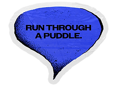
As the target audience revealed to have little spare time for activities, I began to focus on the gaps in-between. The concepts and designs needed to be able to flow and be flexible with even the busiest of schedules - and so the idea of water came into play.
I based the colour palette and textures from what I had observed in the techniques of Zine makers and the language it portrays. Coloured card, messy lines, blotchy ink, the whole lot.
4


BRAND IDENTITY


OVERVIEW
Overall, I am so pleased with how this project turned out, particularly as I felt very uncomfortable at most stages (which I now understand is a sign I'm pushing my creative boundaries!). I loved the blend of traditional print textures mixed into a digital format, which gives the brand a unique and playful feel - this is definitely something I'd like to push further next time!
While there are some design choices I would go back and change (colour palette), I think with more time, I could experiment with physical print transferred into digital for increased authenticity.

